Markets redesign
Project length
4 months
My role
Lead designer
Problem area
Clients find the current experience to be overwhelming and difficult to navigate. Additionally, our existing product doesn’t offer the breadth of tools users are accustomed to having on competitive products.
Solution
A restructured and redesigned experience that adds functionality while reducing cognitive load through the use of proximity and Mobile-specific offloading techniques.
Define
The product
E*TRADE Mobile is an award winning app that aims to simplify investing and trading.
We offer our 2.5MM+ MAU a comprehensive financial product that offers investing, trading, banking and research services.

The experience
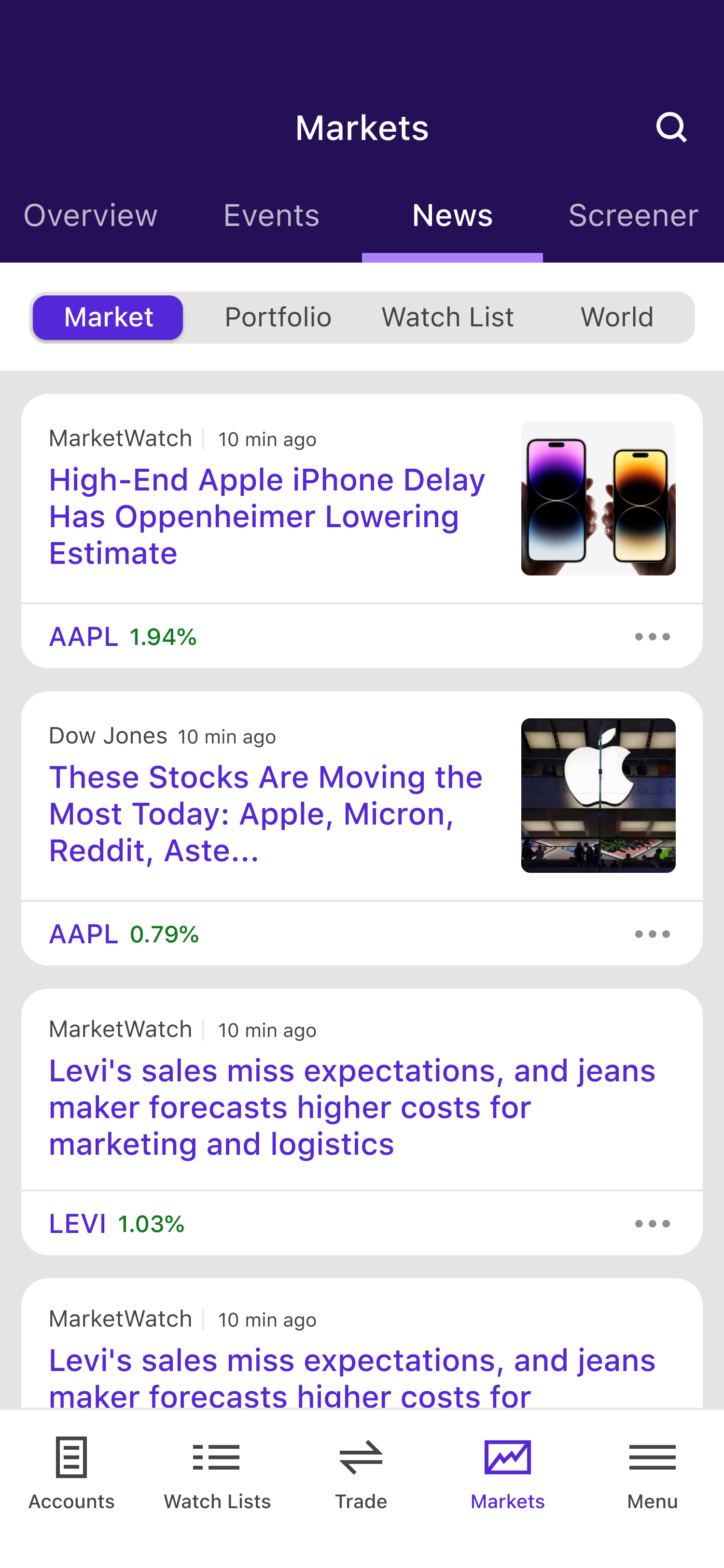
The Markets tab is the 3rd most trafficked experience in the app. It’s highly visible and accessed via a bottom navigation tab.
The tab acts as a central hub for clients to research Stocks, Bonds, ETFs and Mutual Funds.

The strategic approach
Problem area(s)
Clients (particularly new ones) have difficulty navigating and understanding the current experience.
Competitive products are significantly more robust, offering more insights, tools and raw data.
Design strategy
Restructure the IA/Navigation to be less daunting for new clients
Offer customization features that help clients narrow the broad scope of Markets data to suit their individual needs.
Conduct a competitive audit and fill feature gaps.
Thoughtfully integrate ET Web features to expand our overall Mobile offering.
Design
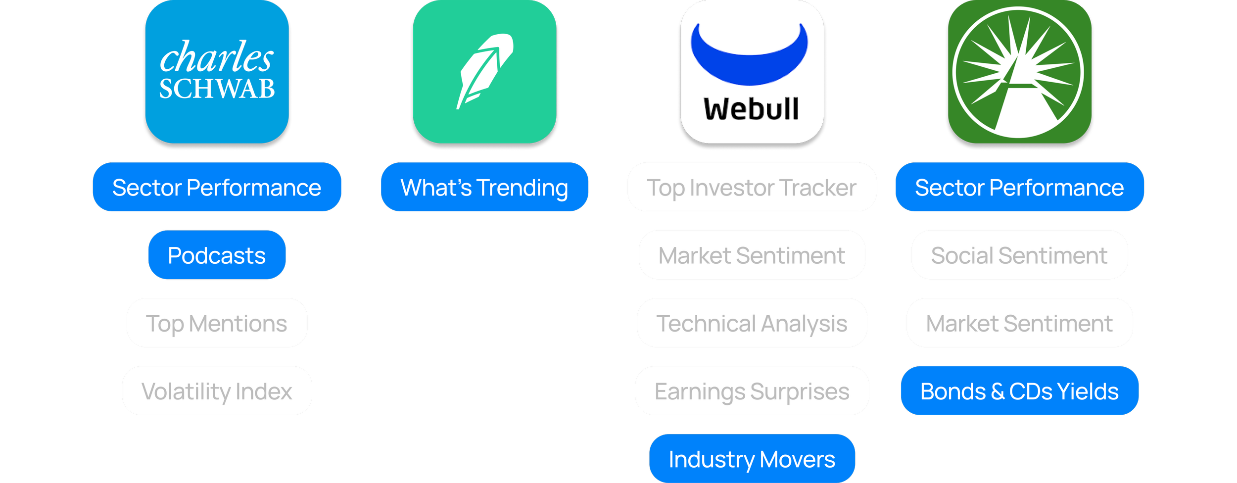
Competitive analysis

We audited the ‘Markets’ experiences of 4 competitors to identify gaps that we could seamlessly integrate into the ETM experience.
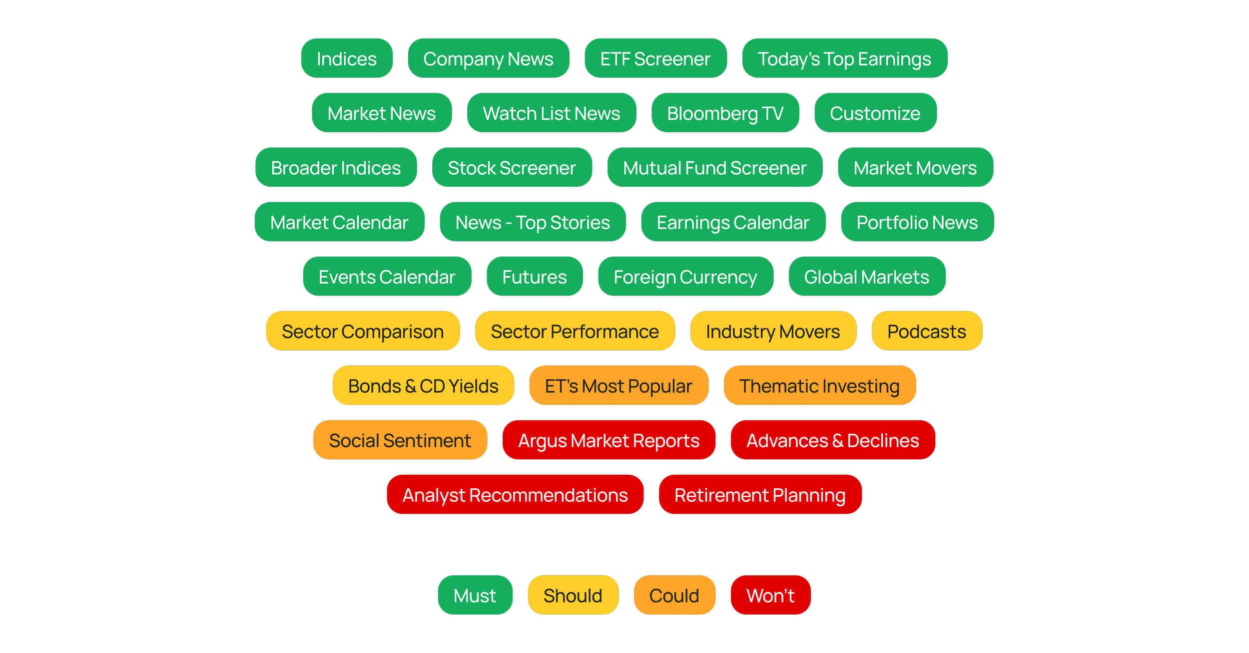
Feature prioritization

Next, we made a list of all of the possible features we could design for and prioritized them based on our platform strategy, capabilities and competitive insights.
Information architecture
Knowing users found the existing IA confusing, we set out to restructure the page, starting with the Overview tab.
The goal here was to make more feel like less. To accomplish this, we applied the principle of ‘proximity’, grouping related content within condensed cards.

Design challenges & solutions
Starting with the ‘Indices and Yields’ card, we faced 2 major design challenges:
A scalable selector that would allow us to fit the 7 different categories of indices/yields into a Mobile card.
A pattern that enabled users to swap indices in and out of their view.


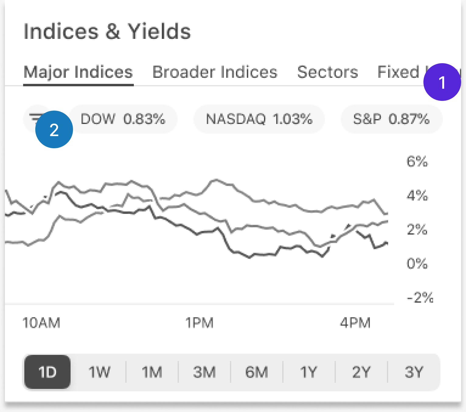
After a few rounds of iterations we decided to utilize a native menu for both interactions.
The indices would be edited using an ellipses icon, while the views could be changed by a trailing dropdown in the header.
This approach proved to be scalable while offloading irrelevant content, further focusing the user’s attention and reducing cognitive load.
We then applied the same pattern to the rest of the page.


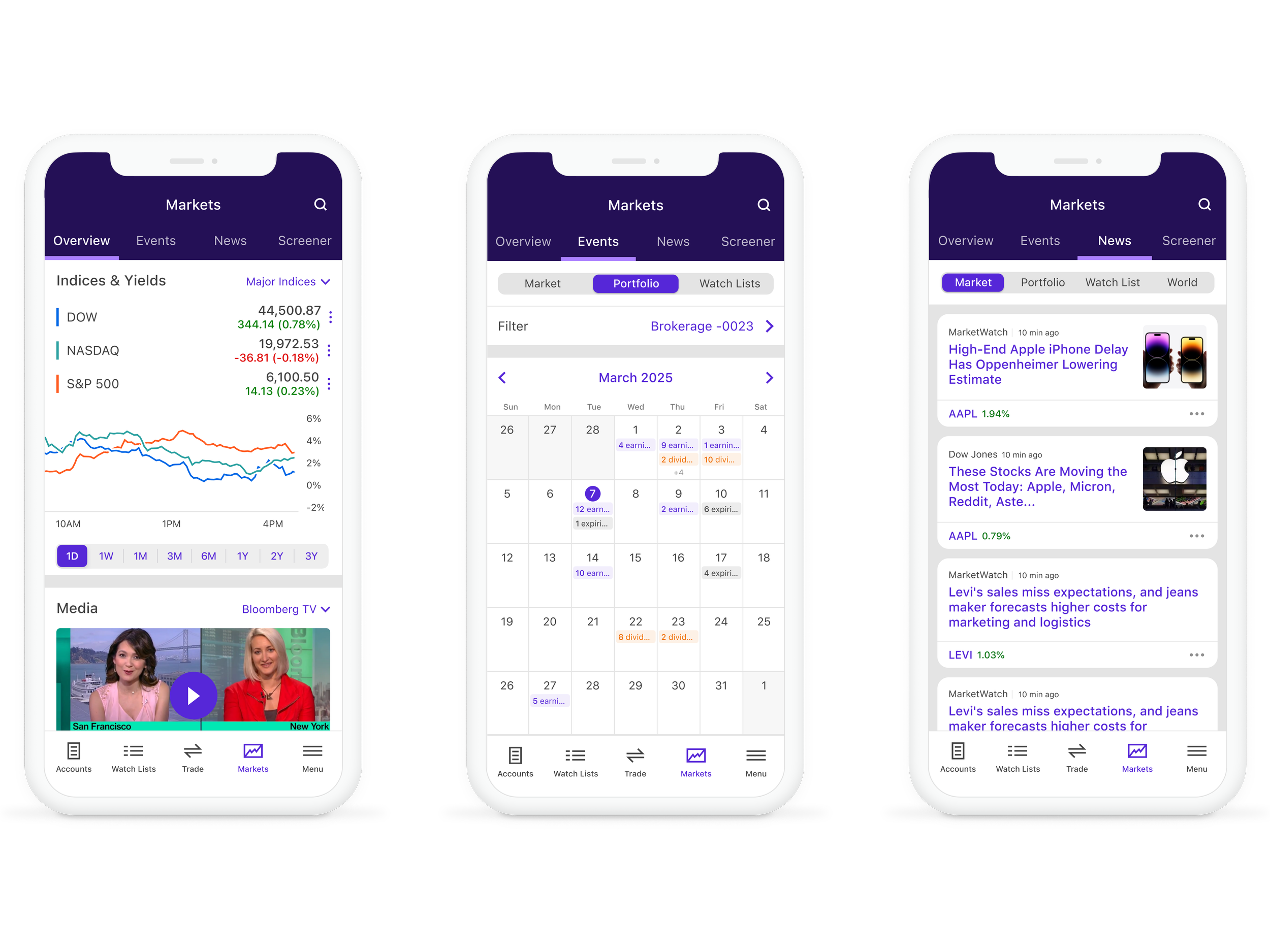
Once the ‘Overview’ page was complete, we dove into the 3 remaining tabs, sticking to our overarching strategy of reducing cognitive load while filling feature gaps.


Before
After


After
Before
After
Before
Deliver
Strategic wrap-up
When delivering the final designs, it was important to tie each of our design decisions back to our overarching strategy.
Strategy
Redesign the information architecture to be less daunting for new clients.
Solution
Grouped previously scattered modules into condensed cards with related content.


Strategy
Offer customization features that help clients narrow the broad scope of Markets data to suit their needs.
Solution
Introduced the ability to set default tabs on the ‘Overview’ page and remove/reorder cards.


Strategy
Fill competitive feature gaps.
Solution
Conducted a competitive audit and designed accordingly.
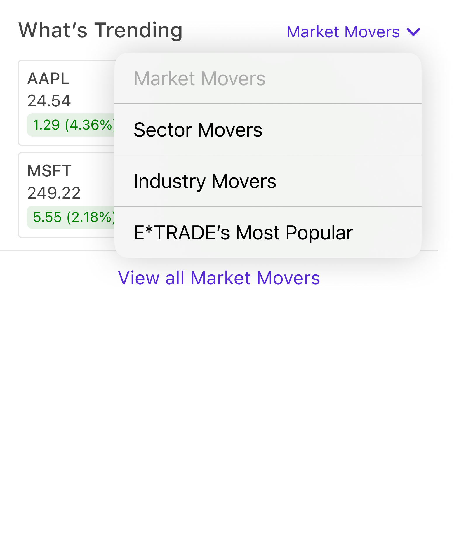
Added an ‘E*TRADE’s Most Popular’ section, similar to Robinhood’s ‘Trending List’.
Added sector and industry specific data, similar to Fidelity’s experience.


Strategy
Thoughtfully integrate ET Web features to expand our overall Mobile offering.
Solution
Added new content such as Podcasts and ‘Behind the Move’ to further enhance our entertainment and news offerings.
Expanded our indices and yields data to include foreign currencies, commodities, and treasury bills, thus allowing us to accommodate a wider range of clients.


Design delivery
Lastly, we delivered native designs for each of the respective operating systems, including tablet and dark mode.
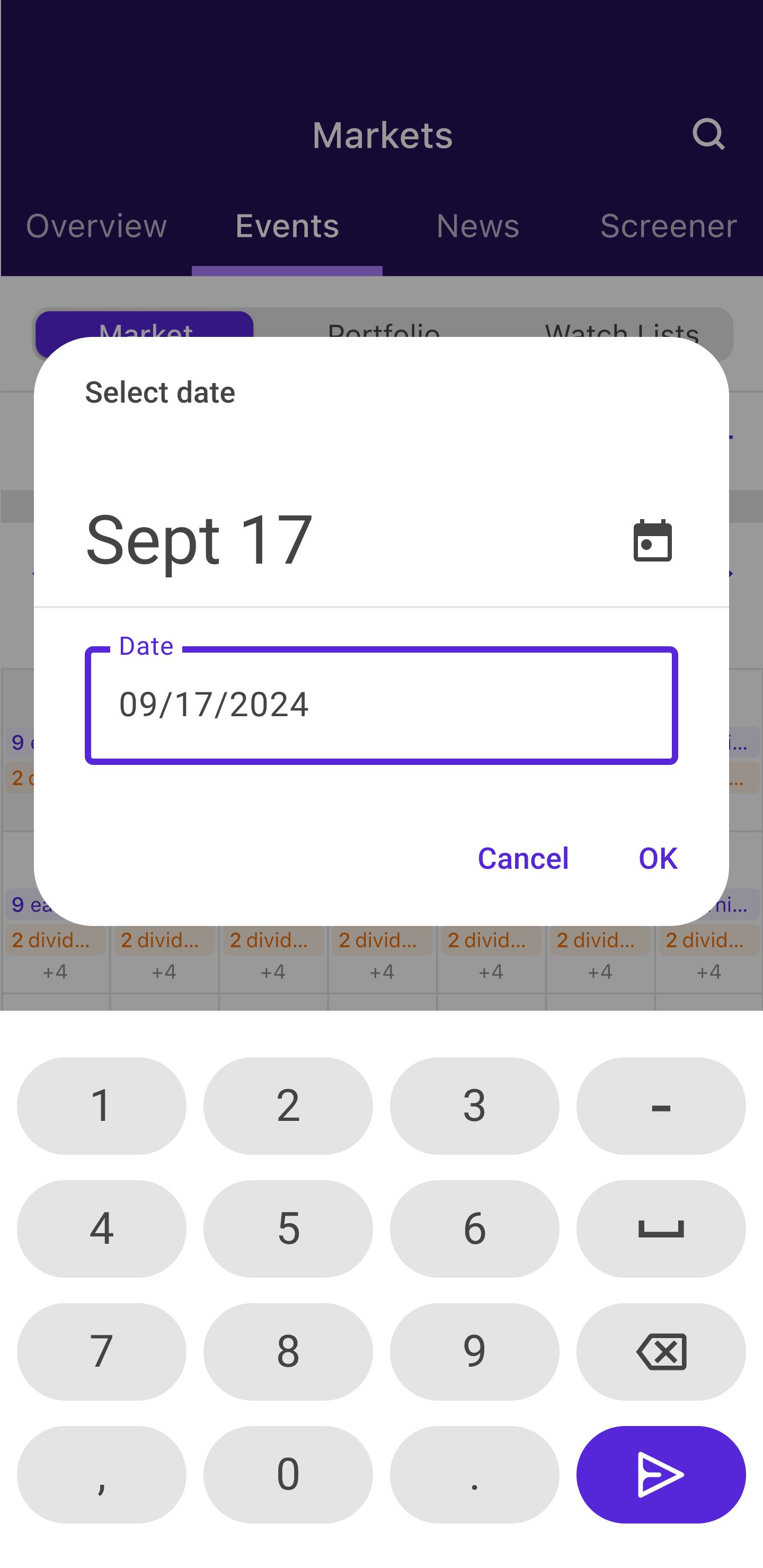
Android Date Picker
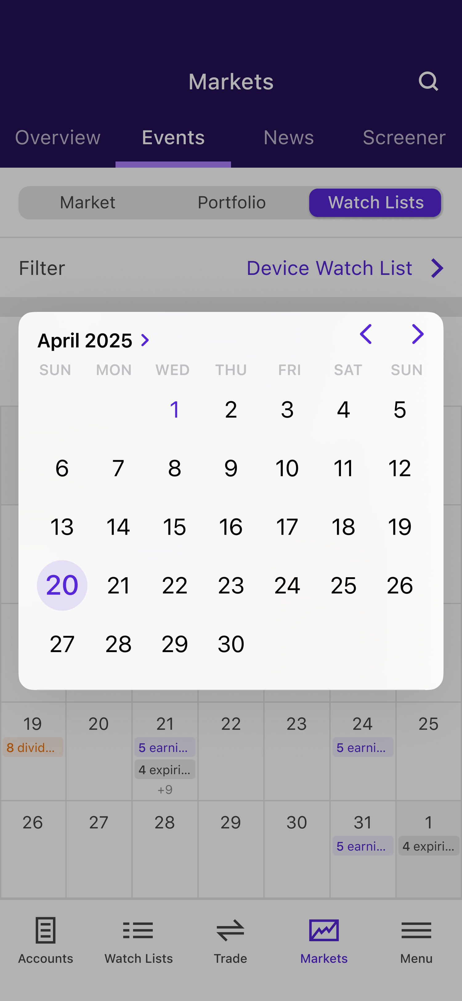
iOS Date Picker
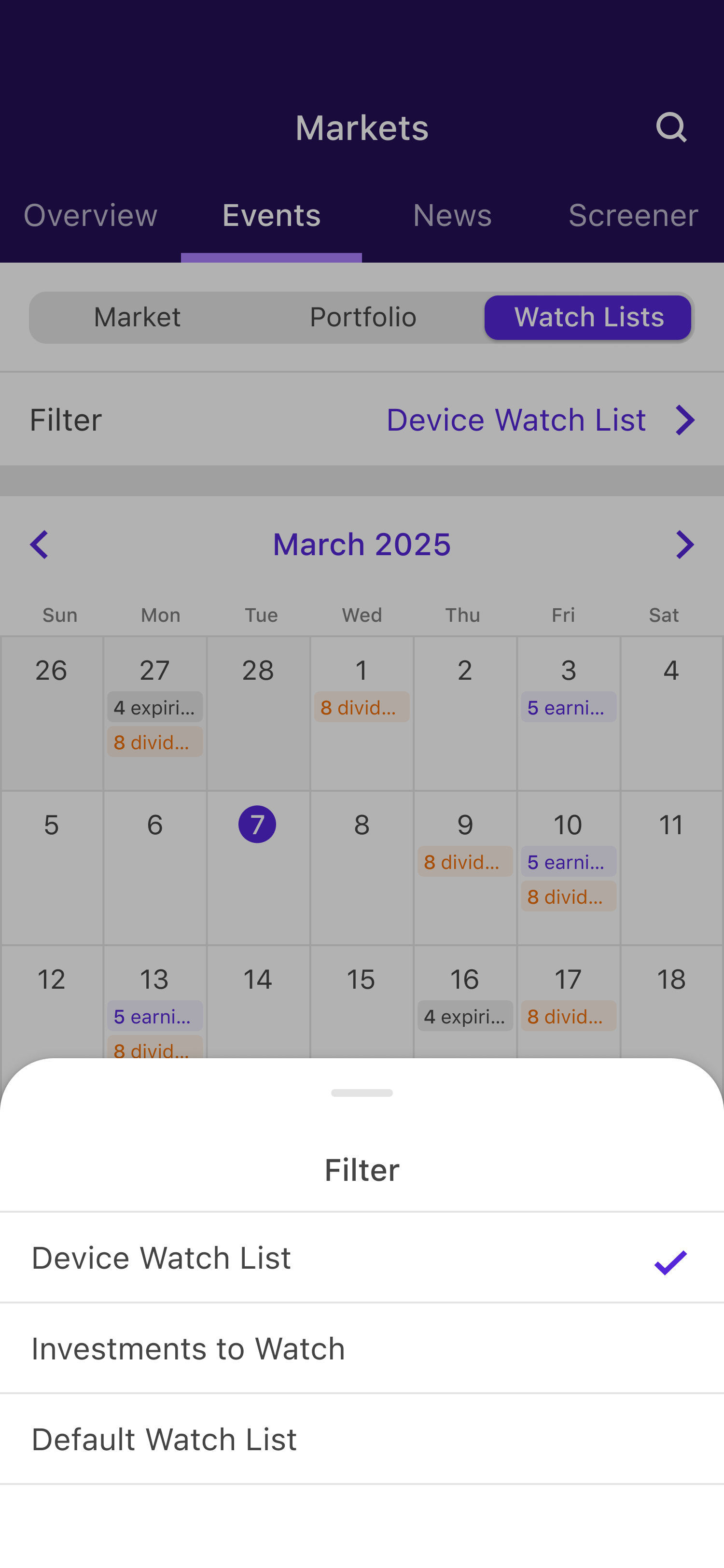
iOS Half Sheet
Next steps
Phase 1 of the Markets experience is expected to be released in October 2025, with the remaining work being delivered in 2026.
Since the completion of this work, we have integrated Crypto trading and market data within the app. The scalable foundation of this design proved to be useful, as it easily scaled to accommodate our new Crypto specific requirements.